Not really machine, is that I am a fortunate citizen of French Republic. So it's again holidays, which means more time to mod. (every 2 months we have 2 weeks holidays, now hate me.)
Reuploaded Seerhuts uncovered, version 1.3.
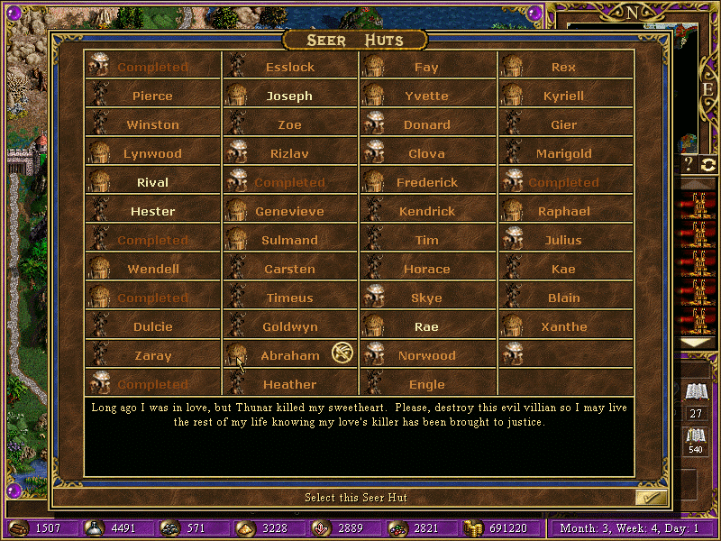
Seer huts in visible area for current player display in Chartreuse color. Not in visible area display in Green. Seer huts with quests completed display in red. I will try later to find also same trick for quest guards but not much place in existing interface, will see.
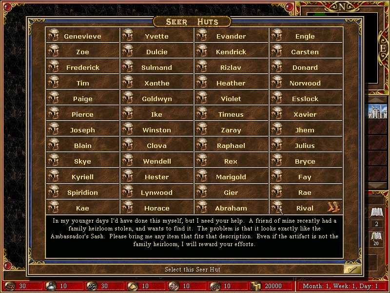
Original is better but very unpractical to find huts you need:
I tried also combinations with colors from same family but result was not very good. Any thoughts? Isn't this too colored now?
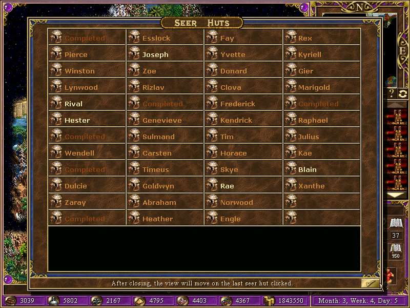
Make green and red lighter.
The light green (chartreuse) is used for seers in visible area, the green for not visible. if I make the green lighter, will be similar.
Then make it another color and after that make it lighter. Right now it clashes with the background.
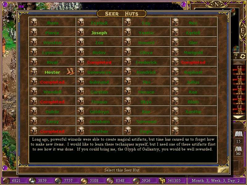
I think the best I could come is this, then I don't know.
Moreover HD 32bit TRUE blocks all colors, so if HD mod, must be only HD 32bit GDI
Valery Wrote:I think the best I could come is this, then I don't know.
Good. But can you make different seer huts icons (as on the map)?
Graphics on map are random, I can't make them match. Ands then if one hut has one graphic in dialog then another graphic on map, the players will ask why.
Isn't seer hut's subtype determines its appearance?
(19.02.2015 09:33)Valery Wrote: [ -> ]I think the best I could come is this, then I don't know.
Not bad.
Right, subtype. Ok, here is how it looks with the seer hut matching the one on the map. But I had to change buttons to defs so I am able to proceed the frames. Personally I prefer the classical view, where all huts look same and can be clicked. What you think?
(19.02.2015 21:37)Valery Wrote: [ -> ]What you think?
Align left for text would be better, imho.
And can you leave the original background instead of black area?
But I don't like it with 3 seer huts graphics, it looks confusing

How do we align text? In dialog editor I have align option set to 1 and no clue what to change to. (ok found, must set to 0)
Does anyone prefer with multiple huts graphics? Will try without black area but it is much more readable this way.
It would help to have in-game images of huts. Would simplify navigation through the dialog even more. Doesn't look bad either if you are concerned about that.
I think that uni buttons about huts are easier to navigate, because we just click then look at text. If I change buttons with defs frames, clicking must be more precise and 2 of huts graphics look bad imo on this background, would need a lighter one. DL does not let us to choose between 3 buttons, as it does with def frames, so is either button-one hut or def-3 huts frames.
Ok, I will make two screens then submit to vote, the majority wins.